Tradingo website

Tradingo website

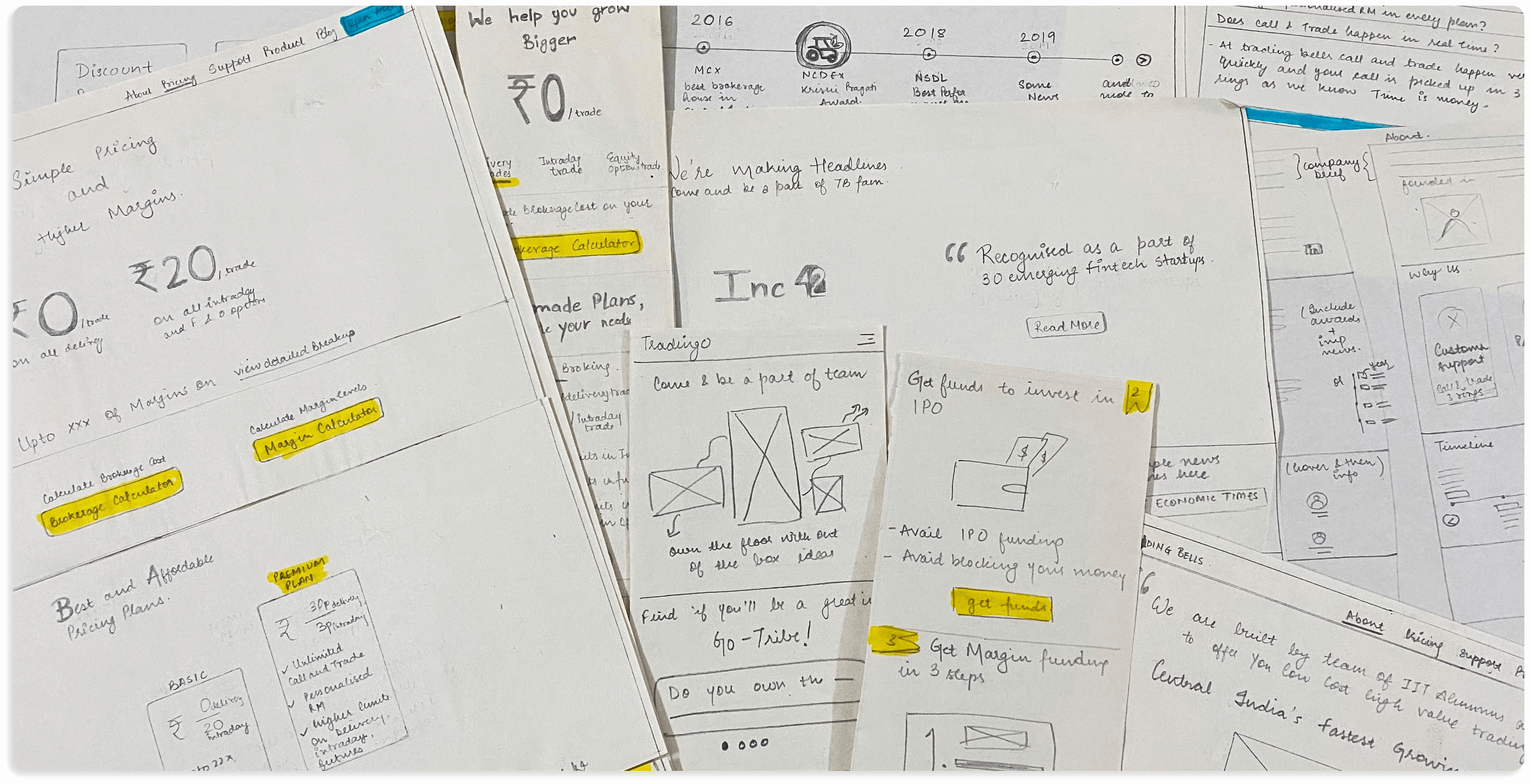
Tradingo is a new-age stockbroker founded in 2016. It is powered by Swastika Investmart Ltd., a 28-year-old financial services company listed on BSE. They were keen to completely revamp their online presence and thereafter increase the user engagement of a younger age bracket.

Fintech

Domain

Tradingo

Client

20 weeks

Duration

Domain

Fintech

Client

Tradingo

Duration

20 weeks

The challenge.

Tradingo has a target audience that is comparatively new to stock trading and has little knowledge about the financial world. The challenge was to create a website that makes any new user feel that stocks are not as complicated as they seem to be. The aim was to make the user confident enough to start trading with them and to convince them that their money is secure with the company.

Tradingo is a new-age stock broker founded in 2016. It is powered by Swastika Investmart Ltd., a 28 year old financial services company, listed on BSE. They were keen to completely revamp their online presence and thereafter increase the user engagement of younger age bracket.

The challenge.

Tradingo has a target audience which is comparatively new to stock trading and has little knowledge about the financial world. The challenge was to create a website which makes any new user feel that stocks are not as complicated as they seem to be. The aim was to make the user confident enough to start trading with them and to convince that their money is secure with the company.

Research

Tradingo website aimed to convince any potential customer to start using Tradingo’s services, thus aiding the sales team with increased conversion numbers. We started the research process by looking at Google Analytics for the old website. Usually, this process reveals information on user behavior and on content that most users seek. Further, interestingly, we listened to the recorded telephonic conversations between the Tradingo sales team and their potential customers. These were a bunch of good and bad calls where we identified what kind of queries do stock market beginners and advanced traders have and how they are answered. We figured out patterns in the sales teams’ telephonic pitches and used the same fundamentals to create the website.

Analyse

From the research, we analyzed that to convince the users, we need to focus on four factors - Trust, Popularity, Pricing, and Support. Further, we incorporated the Six Universal Principals of Persuasion by Dr. Robert Cialdini. By combining all these, we started framing narratives and stories leading to any user’s journey until they click the ‘Sign-up’ button. All the data points collected in the research process helped us create accurate user personas and their ideal journeys. As an example, visitors didn’t understand the financial jargon. This sole finding led us to analyze how we can make the user feel at home by simplifying the overall language and give help-text wherever required.

Ideate

For users, any website is easy to navigate if they find what they are looking for without diving deep into the website, i.e., placing the functionalities in consistency with their past experiences. The ideation process always involves conducting a few workshops with stakeholders to quickly come-up with astonishing ideas. As an example, we conducted a card sorting workshop. The primary goal of a sorting activity was to discover which items should be grouped together and what these groups should be called. For this activity, we involved potential new users, daily traders, and other company officials. Participants were asked to organize the cards which had topics from the website. This activity enabled us to conclude the terminology, relationships and categorize various topics that helped us frame the website's information architecture. Other workshops helped us to simplify technical words, the process of signing-up, etc.

Conceptualize

Wireframing is essential in every UX process; it helps visualize how the website will look, prioritize content on every page according to the user, and establish the structure and flow of possible design solutions. We combined knowledge gathered through all the above processes and got to our drawing sheets. After a continuous iterative process, we built wireframes that looked really simple to any user and were high on usability at the same time. We made sure we had CTAs at the best possible places to help the user navigate to the desired information.

Design

Quirky designs were used to cut the boredom, which is usually associated with stock trading. We chose the right fonts and bright colors to connect to a younger audience and match the brand’s vibe. This also gave the website a more youthful look. We reduced the cognitive load of the users by highlighting the commonly used words. We played with the up/down arrows used in the logo and brought the brand’s essence everywhere on the website.

Swastika website

case study

Tradingo app

case study

Swastika website

case study

Tradingo app

case study

Ready to make your idea work?

Let's talk