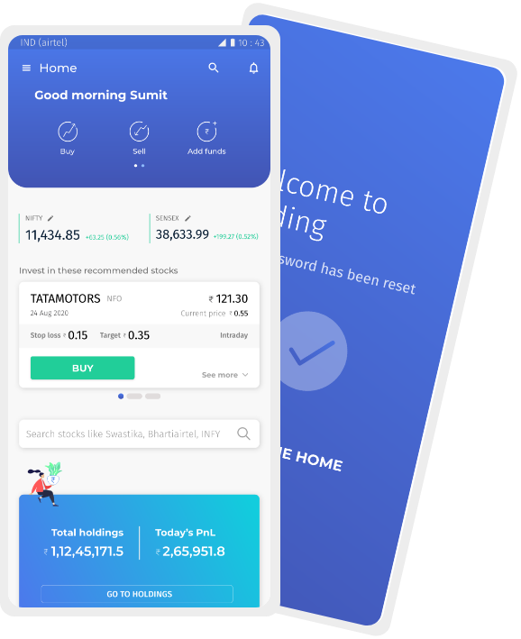
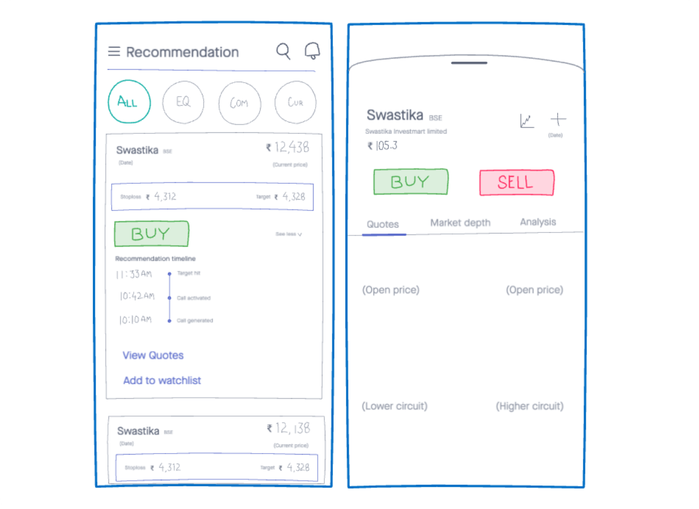
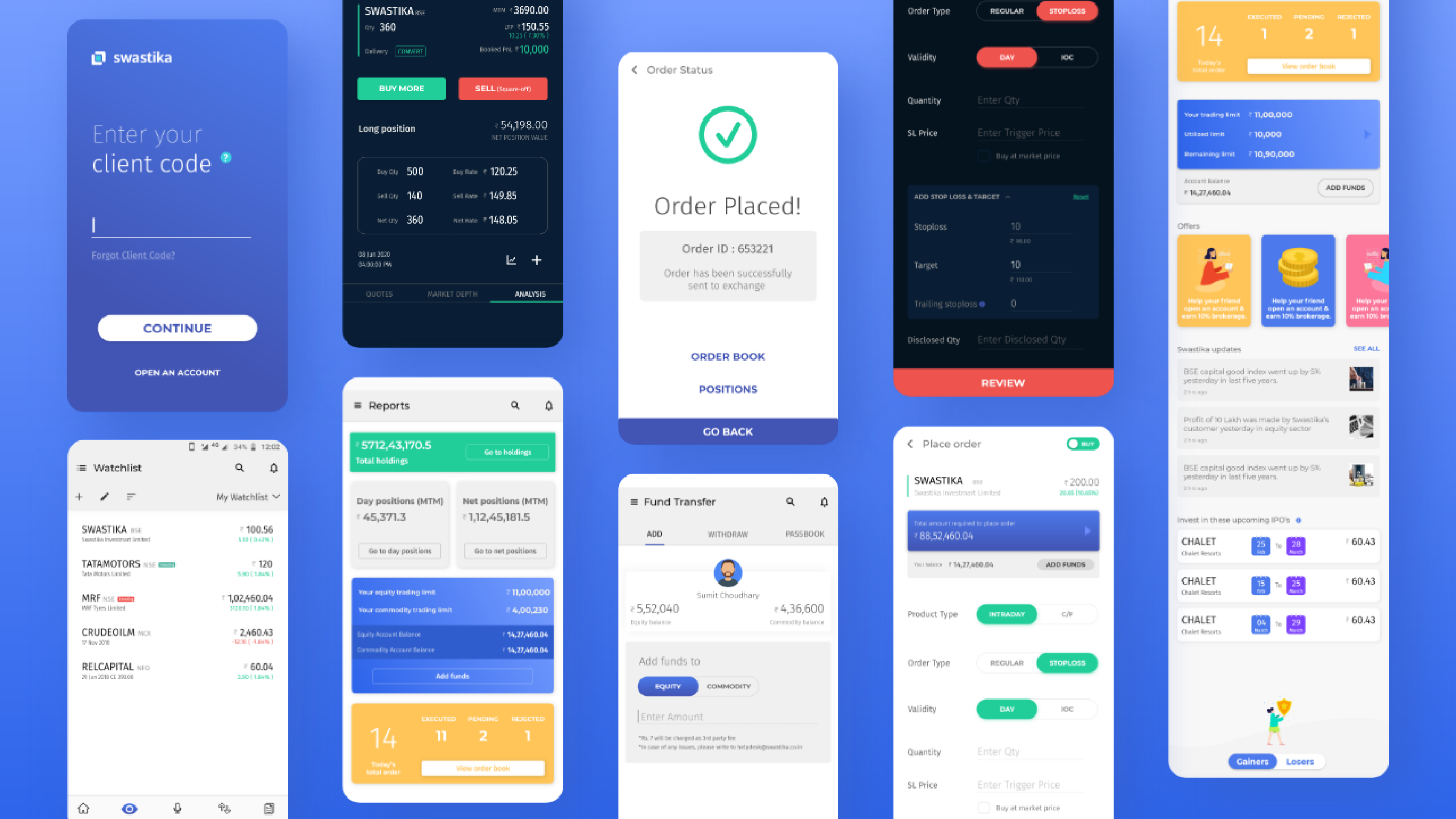
Tradingo app

Tradingo App

Tradingo is an Indian stock trading platform. It is used by more than 1,50,000 users in India. People at Tradingo sought out to completely revamp their existing mobile and web application to create a better experience for the users and ultimately increase the number of transactions.

Tradingo is an Indian stock trading platform. It is used by more than 1,50,000 users in India. People at Tradingo sought out to completely revamp their existing mobile and web application to create a better experience for the users and ultimately increase the number of transactions.

The challenge.

Stock trading is a very complex domain with loads of cumbersome processes and technical jargon. The old traders are well accustomed to these technicalities, but the new ones find this back-breaking. Our primary challenge was to learn these processes and come up with a product that appeals to both old and new traders.

Research

Research for Tradingo app happened in various phases. In the first phase, a field study was conducted where users (specifically daily traders) were observed in their original environment. We understood the reasoning behind the actions they had undertaken before starting to trade and post-trading hours. We gathered information regarding their communication with Tradingo team, their behavior while fetching news and figured out what compelled them to make a decision to place a certain trade.

In the second phase, essential questions were formulated for a large-scale survey. This was to understand the behavioral patterns of various people at large, with respect to things like funds transfer, segment study, etc. This was done with people who have been trading for more than 2 years.

The third phase study was focused on understanding the new generation of users. What their pain points are, and the reasons why they find these trading apps complex. This research was done in the format of a series of ’focus groups’ where 6-8 people would participate in a facilitated group discussion.

Research for Tradingo app happened in various phases. In the first phase, a field study was conducted where users (specifically daily traders) were observed in their original environment. We understood the reasoning behind the actions they had undertaken before starting to trade and post trading hours. We gathered information regarding their communication with Tradingo team, their behaviour while fetching news and figured out what compelled them to make a decision to place a certain trade.

In the second phase, important questions were formulated for a large-scale survey. This was to understand behavioural patterns of various people at large, with respect to things like funds transfer, segment study etc. This was done with people who have been trading for more than 2 years.

Third phase study was focused on understanding new generation of users. What their pain points are, and the reasons why they find these trading apps complex. This research was done in the format of series of ’focus groups’ where 6-8 people would participate in a facilitated group discussion.

Analyse

The most significant finding of the analysis was that 70% of users would not want to look at or get disturbed by too much financial data. Instead, they would like to directly look at recommendations and place the buy or sell order.

We performed empathy mapping to identify how various types of users would feel, think, say, or do at different points in the journey of completing their trading-related tasks. This helped us uncover needs that users themselves may not be aware of.

Ideate

The whole app was structured on the basis of how important each task is. Task analysis was performed in detail for all top tasks. This detailing of tasks helped us make sure that no micro-action gets ignored during the whole process.

Traditionally the most complex part of any stock trading application is executing any buy or sell order. There’s just too much information that the user has to fill and submitted to the stock exchanges. We ideated simpler ways of taking inputs from the users keeping in mind that advanced users would need more input fields.

Conceptualize

This is where the action started. A lot of drawing and iteration and re-iteration happened during wireframing. Several times, meetings and workshops were held with stakeholders while giving shape to the app. One such instance was a workshop for prioritization of widgets on the home screen. This was very dependent on the type of person using the app. Hence, we ultimately decided to keep it customizable. Another major decision before beginning to wireframe every module was the placement of items for navigation. Since there are so many items the user can navigate to, we decided to keep the bottom bar as well as left navigation.

Design

The first thing we decided to do was clear the clutter. We wanted to give a feel that trading is fun & simple for advanced as well as novice users. A clean interface design did the trick. At the same time, we made sure to choose typefaces that can accommodate a lot of data in smaller spaces and make looking at numbers easy. A light theme was incorporated as it is scientifically easier to use, but at the same time, an option to switch to a darker theme was required as traditional traders are used to seeing numbers blinking on a black screen.

Swastika website

case study

OrangeTrack

case study

Ready to make your idea work?

Let's talk