De-stock App


De-stock App
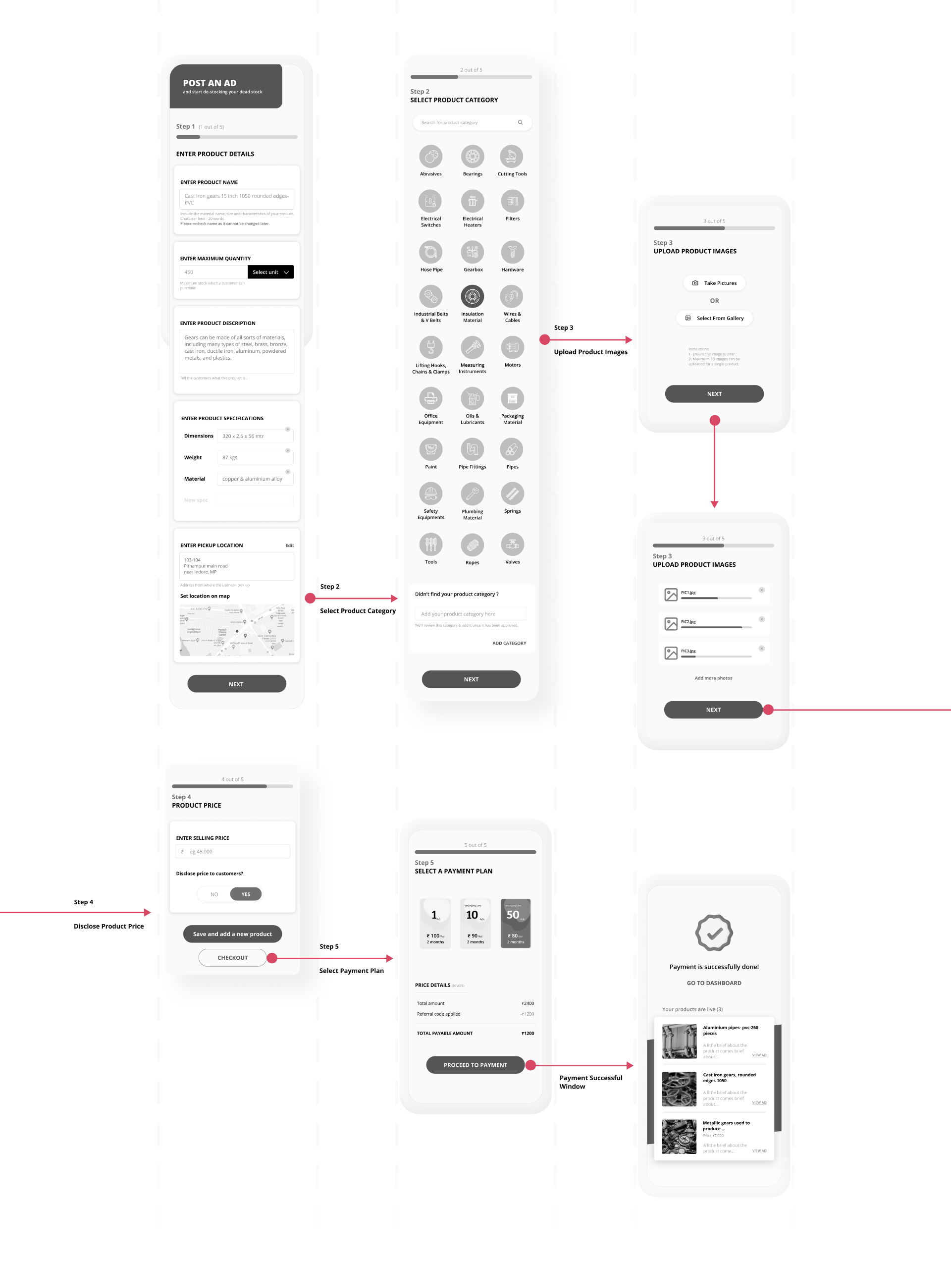
De-Stock is a platform for trading industrial raw material. Their aim is to enable users from various manufacturing industries to buy or sell their non-moving or unused material. The founder identified this gap in their existing traditional business and hence sought out to create De-stock.

E-Commerce
Domain
De-Stock
Client

2 weeks
Duration
Domain
E-Commerce
Client
De-Stock
Duration
2 weeks


 Jakob's law